The Impact of Color Choices on Space Perception in Minimalist Design
Understanding Color and Space in Minimalism
Color influences our perception of space in profound ways, especially in minimalist design. The right choices can enhance or diminish a room’s sense of openness. As we delve into this topic, we uncover how color psychology shapes our experiences within specific settings.
Key Elements of Color and Space Perception
Understanding the dynamics of color in relation to space is essential for creating environments that feel both functional and aesthetically pleasing. Among the critical factors to consider are:
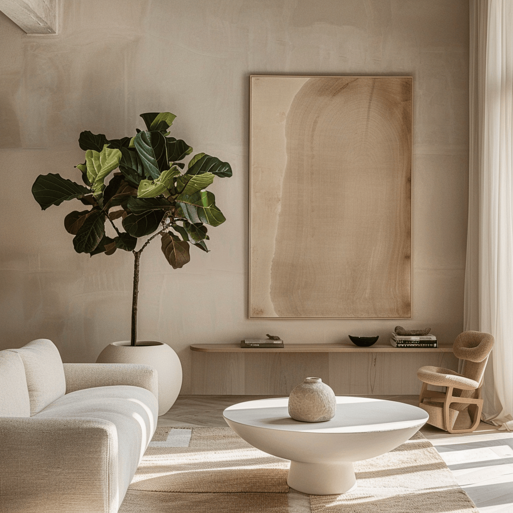
- Light vs. Dark Tones: Lighter colors, such as whites, pastels, and pale grays, tend to make spaces feel larger and more open. For instance, a small apartment painted in soft pastel shades can feel airy and spacious, serving to elevate the mood of the inhabitants while maximizing the spatial perception. In contrast, darker hues, like deep navy or charcoal, can create a more enclosed feeling, making a room seem smaller and cozier, which may be desirable in certain settings like a home theater.
- Warm vs. Cool Colors: The psychological impact of warmer colors, such as reds, yellows, and oranges, can create a cozy and inviting atmosphere. This is particularly effective in communal spaces like living rooms or kitchens where interaction is encouraged. On the other hand, cool colors, including blues and greens, promote calmness and serenity, making them excellent choices for bedrooms or meditation spaces where relaxation is the primary goal.
- Contrast and Balance: The strategic use of contrasting colors can accentuate architectural features and guide the eye gracefully throughout a space. For example, a minimalist home featuring white walls with bold black trim not only enhances the modern appeal of the home but also emphasizes clean lines and sharp angles, making the architecture itself a focal point.
These aspects highlight why color selection is crucial in minimalist designs that prioritize functionality without sacrificing aesthetics. Designers often rely on a limited palette to maintain simplicity, yet the impact of each chosen hue creates a unique effect. This subtlety is key for creating distinct environments that resonate emotionally with users and provide an engaging backdrop for daily activities.
Inviting Exploration
Throughout this article, we will explore various examples that showcase how color influences spatial perception in minimalist design. For instance, consider a well-designed art gallery that uses a neutral color scheme to allow artworks to stand out, emphasizing the balance between the best elements of the design and their surrounding space. By examining different settings and their accompanying color schemes, you’ll gain a deeper understanding of how to enhance space effectively.
Ultimately, the interplay between color and design has the potential to evoke emotions and stimulate creativity. By understanding these elements, you can redefine your own approach to minimalist spaces in your home or workspace, transforming them into thoughtfully crafted environments that enhance both livability and functionality. Dive deeper into the world of color and minimalism, and you may uncover new inspirations that will elevate your personal design philosophy.
DISCOVER MORE: Click here to learn how minimalism can streamline your day
The Role of Color in Shaping Spatial Experiences
The interplay between color and space is a vital aspect in minimalist design, where every detail counts. This approach emphasizes function while also considering the emotional response of those inhabiting the space. Understanding how color choices affect spatial perception can facilitate the creation of environments that not only look appealing but also feel harmonious and balanced. Let’s examine the multifaceted roles that color plays in shaping our spatial experiences.
Influence of Light Color on Perceived Space
One of the most striking effects of color in minimalist design is the impact of light colors on space perception. Walls painted in light colors such as soft whites, creams, and pale pastels amplify natural light, creating a sense of openness. This is especially crucial in urban settings where space can be limited. For instance, a small studio apartment adorned with light hues can appear significantly larger and more inviting, effectively transforming the environment. Conversely, darker colors can create a sense of intimacy but may also lead to feelings of confinement.
- Reflectivity: Light colors reflect more light, thus enhancing brightness and openness, while darker shades absorb light and can make a room feel smaller.
- Emotional Impact: Light tones promote feelings of calmness and serenity, vital in spaces meant for relaxation, such as bedrooms or meditation rooms.
Moreover, even within the realm of light colors, variations exist. For example, a crisp white can evoke a feeling of sterility and coldness, while a warm beige adds an element of warmth and comfort. Therefore, color choices should be thoughtful and deliberate, especially when the goal is to enhance space perception.
Warm and Cool Colors in Minimalist Interior Design
The categorization of colors into warm and cool can also influence the sensation of space. Warm colors, like yellows and reds, often draw the eye and create an inviting atmosphere. Ideal for communal areas such as dining rooms or living spaces, these shades can foster feelings of friendship and energy, encouraging social interaction. In contrast, cool colors, including blues and greens, typically convey tranquility and spaciousness. These colors are commonly used in areas designated for relaxation, such as bedrooms or study rooms.
- Social Connectivity: Warm colors can create a lively ambiance, making spaces feel more communal.
- Serenity and Calm: Cool colors promote a peaceful vibe, contributing to the perception of larger space due to their receding quality.
Choosing the appropriate temperature of a color based on the intended function of a space can work wonders. Combining both warm and cool tones within a single design can create a diverse and dynamic environment, simultaneously enhancing visual interest and spatial perception.
As we venture deeper into understanding the nuances of color in minimalist design, we will look at how contrast and harmony contribute to the overall perception of space, ultimately guiding us toward creating interior environments that resonate with both beauty and functionality. This exploration not only broadens your understanding of design principles but also ignites creativity in your own personal spaces.
The Role of Color Psychology in Minimalist Spaces
When considering the impact of color choices on space perception in minimalist design, one cannot overlook the principles of color psychology. Colors evoke specific emotions and can dramatically influence how we perceive a room’s size, brightness, and overall ambiance. For instance, lighter shades such as whites, soft beiges, and pastels can make spaces feel more open and airy. In contrast, bold hues like dark blues or greens can create a sense of depth and intimacy, making the same space feel more confined.In minimalist design, where simplicity is key, color plays a critical role in maintaining a clean aesthetic while simultaneously enhancing spatial perception. Utilizing a limited color palette helps to streamline visual clutter, allowing the features of the space—like natural light and architectural elements—to take center stage. For example, painting an accent wall in a striking color can draw the eye and create a focal point, adding interest without overpowering the minimalistic approach.
Contrast and Its Effect on Depth Perception
Contrast is another fundamental aspect of how colors impact our perception of space. High contrast between surfaces can lead to a more dynamic environment, causing the space to feel larger as our eyes are guided through the design. On the other hand, low contrast can result in a sense of uniformity. This is particularly important in minimalism, where less is often more. Colors can also be strategically combined to influence spatial arrangements. For instance, using a darker shade at the back of a room can enhance the illusion of depth, while brighter and lighter colors in the foreground create a sense of openness. This understanding of color placement and its effects on perception is essential for designers striving to maximize both aesthetic appeal and spatial functionality.
Color Trends that Shape Modern Minimalist Designs
Current trends in minimalist design often favor a blend of natural and neutral tones inspired by the surrounding environment. Earthy colors, such as terracotta, sage green, and sandy beige, create a harmonious connection with nature, fostering a serene atmosphere. Such color selections contribute not only to a calming aesthetic but also enhance our perception of space by integrating indoor and outdoor environments.Moreover, in the age of sustainability and healthy living, natural colors help emphasize environmentally friendly design choices. They promote well-being, demonstrating that our color preferences can also influence our mental state and perceptions of comfort and serenity within minimalist spaces.As we dive deeper into the significance of color choices in minimalist design, it becomes evident that the intersection of perception, emotion, and aesthetics is crucial. Understanding how to effectively utilize color can profoundly impact our experiences within these carefully curated environments, inviting a comprehensive exploration of minimalist design’s capabilities in shaping our surroundings.
DIVE DEEPER: Click here to discover space-saving strategies
The Effects of Contrast and Harmony on Space Perception
As we delve deeper into the relationship between color and spatial perception in minimalist design, it’s essential to evaluate how elements such as contrast and harmony contribute to the overall atmosphere of a space. Striking a balance between these two concepts can significantly influence how we interact with, perceive, and ultimately experience our environments.
Understanding Contrast in Minimalist Design
Contrast—the juxtaposition of different colors—plays a critical role in emphasizing spatial delineations within minimalist interiors. When applied judiciously, contrasting colors can create visual focal points, drawing attention to specific areas or elements of a space. For example, a wall painted in a soft, muted hue can be beautifully offset by a vibrant artwork or furniture piece, thus enhancing the perception of depth and dimension.
- Visual Hierarchy: Contrast helps establish a visual hierarchy that can guide the viewer’s eye through the space, making it easier to navigate. By directing focus on particular design elements, contrast can enhance the sense of spatial organization.
- Dynamic Interaction: The use of contrasting colors can foster a dynamic interaction between different areas, preventing a monotone feel that might otherwise leave a space feeling stagnant or uninspiring.
However, achieving the right level of contrast requires careful consideration. Utilizing too many contrasting colors can lead to visual chaos, undermining the minimalistic ethos of simplicity. A minimalist design should embrace contrast cautiously, ensuring it enhances rather than detracts from the serene environment.
Establishing Harmony for Cohesion
On the other end of the spectrum lies harmony, which involves coordinating colors in a way that creates a sense of balance and coherence. In minimalist design, harmony can foster an environment that feels unified and tranquil, essential for promoting mental clarity and relaxation. This principle can be achieved through analogous color schemes, where colors sit next to each other on the color wheel, offering a subtle, blended aesthetic. For example, pairing soft blues with gentle greens can evoke a calming seaside ambiance, enhancing the perception of openness and spaciousness.
- Spatial Consistency: A harmonious color palette can contribute to a consistent spatial narrative, making it easier for occupants to feel ‘at home’ in the environment.
- Natural Flow: Harmonious colors create a seamless visual flow, linking different areas together and reinforcing the spatial dynamics of the design.
Moreover, incorporating natural colors inspired by surroundings—such as earthy tones that mimic wood, stone, or foliage—can establish a deeper connection between interior spaces and the environment outside. These subtle connections can enhance the perceived size of a space, as it invites the expanse of the outside world into the interior realm.
Color Psychology’s Role in Minimalist Spaces
The psychological impact of color in minimalist design cannot be overlooked either. Color psychology suggests that different colors evoke various emotions and psychological responses. For instance, while soothing colors may promote relaxation, brighter, bolder tones can elicit feelings of energy or excitement. Understanding the emotional undertones of colors allows designers and homeowners alike to create spaces that cater to their specific needs, whether that involves fostering peace in a meditation area or encouraging creativity in a work environment.
As we recognize the importance of these color principles in minimalist design, it’s clear that choices made in the color palette can significantly influence both the energetic flows of a space and the perception of its size. By thoughtfully considering contrast, harmony, and emotional responses, designers can create interiors that resonate with both aesthetic appeal and functional purpose, ultimately revolutionizing how we inhabit and perceive our environments.
DISCOVER MORE: Click here to optimize your space
Final Thoughts on Color Choices and Spatial Dynamics in Minimalist Design
In conclusion, the impact of color choices on space perception within minimalist design cannot be overstated. Throughout this exploration, we have seen how elements such as contrast and harmony work hand in hand to shape our experience of interior spaces. By effectively utilizing contrast, designers can highlight focal points, guide viewers through a space, and create a dynamic interplay that invigorates the environment. Conversely, a harmonious palette fosters a sense of unity, offering tranquility and emotional balance that is crucial for mental well-being.
Moreover, understanding the psychological implications of color further adds a layer of depth to minimalist design. Each color carries distinct emotional weight, allowing designers to tailor environments to foster specific atmospheres—be it calmness, creativity, or energy. In embracing these principles, we can see how thoughtful design not only enhances aesthetic appeal but also transforms our interaction with and perception of space.
As we continue to engage with and refine minimalist aesthetics in various contexts—be it residential, commercial, or public spaces—considering color as a fundamental component of the design process is vital. By doing so, we can create interiors that are not only visually stunning but also resonate deeply with our human experience. In the quest for spaces that feel larger, more cohesive, and emotionally satisfying, the strategic application of color remains an invaluable tool in the designer’s repertoire.
Related posts:
Maximize Small Spaces Minimalist Organization Tips for Urban Apartments
The Role of Multi-Functional Furniture in Minimalist Design
The Psychology of Open Spaces: How Layout Affects Mindfulness and Organization
Seasonal Minimalism: Adjusting Your Space Optimization Strategies Throughout the Year
Creating a Minimalist Kitchen: Essentials for Efficient Space Optimization
Maximizing Small Living Spaces: Strategies for Effective Space Optimization

Linda Carter is a writer and organization expert specializing in minimalism and personal organization. With extensive experience helping individuals create clutter-free, functional spaces and adopt mindful habits, Linda shares her knowledge on our platform. Her goal is to empower readers with practical advice and strategies to simplify their lives, stay organized, and achieve a sense of calm and balance in their daily routines.